MY ROLE
2 Designers
THE TEAM
2 designer, 3 engineers
TIMELINE
November 2023
reducing bounce rate
of park+ homepage to 25%
Back
OVERVIEW
The Park+ app faced a high bounce rate of 56% due to navigation difficulties, slow load times, and low visibility of services. By redesigning the homepage to include an enhanced top bar with car information, a prominent search bar, and key services placed above the fold, we improved navigation and service discoverability. Extensive user testing validated these changes, resulting in a 25% reduction in the bounce rate and significantly increased user engagement.
Let's collaborate and
design the next big thing!
My mail Id
RESEARCH
Quantitative
data analysis
Total users
3,16,000
Interacted users
1,39,000
Bounce rate
56%
Page load time
5+ seconds
Click through rates
FASTag (48k), buy petrol (10k), and Challan (16.5k), other services (29 - 2,000 clicks)
Survey
(60 people)
High dissatisfaction and navigation issues:
40% of users are dissatisfied with the homepage and find it difficult to navigate.
Slow loading time
82% of users report that the homepage loads slowly or very slowly.
Critical information above the fold
40% of users rarely or never scroll past the first fold
Clear communication needed
50% of users find promotions unclear, and 60% find sections of the homepage confusing.
Awareness of additional services
45% of users are unaware of services like car servicing, bill payments, brand deals.
User calling
(12 users)
Confusion
Users find the current homepage cluttered and overwhelming, confusing and difficulty in navigation.
Clarity issues
Misunderstandings about promotions, particularly related to Park+ petrol offers
Navigation and service Discovery
Users struggle to find specific services easily due to poor navigation and an overloaded homepage.
Performance concerns
Slow load times and frequent reloads disrupt the user experience
Recommendations
Users suggest a simplified, cleaner layout, enhanced search functionality, clearer promotions, etc
Secondary
research
Competitive analysis
Analyzed superapps like Gojek, Paytm, PhonePe, Grab, Uber to identify best practices in homepage layout
Read articles
on how superapps work, load time can be reduced, navigation can be made better, how alerts are shown
PROBLEM
High Bounce Rate:
56%
Slow Page Load Times:
More than 5 seconds
Low Click-through Rates:
Uneven click distribution, issues with visibility and prioritisation.
Low Click-through Rates:
For elements below the first fold
User Confusion:
Many users found it difficult to navigate and find essential services.
PAIN POINTS
Navigation issues and difficulty in finding needed services quickly.
Heavy content and numerous elements on the page impacting performance.
Users are not scrolling down to access additional content.
Poor visibility and prioritization of other services, making them less accessible to users.
Slow loading times affecting user retention.
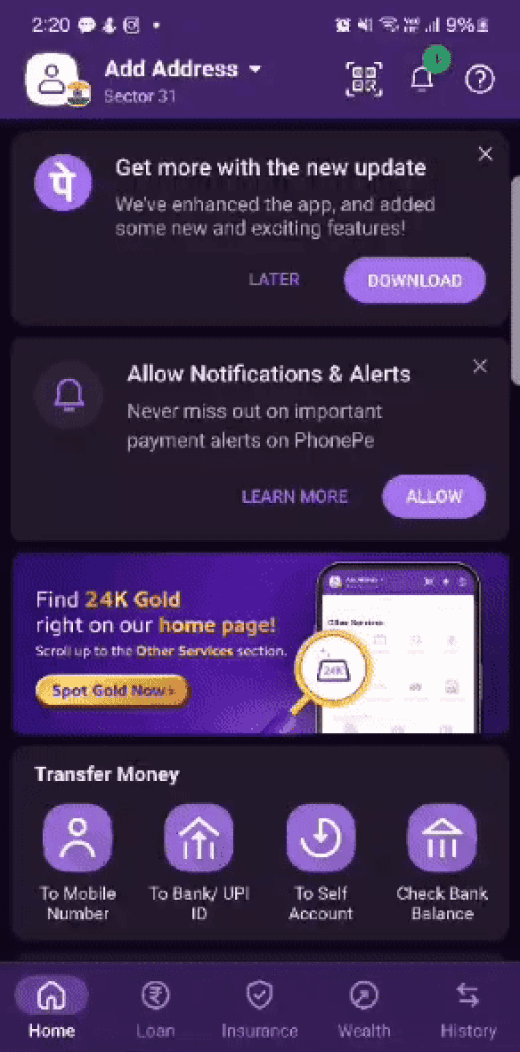
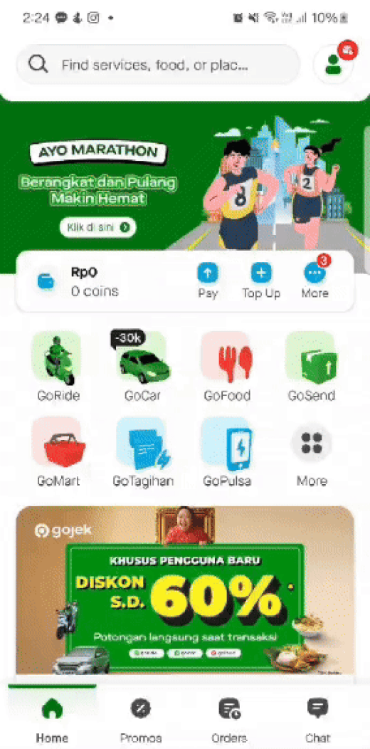
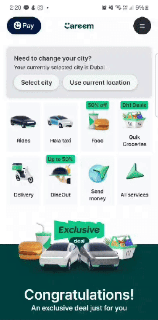
COMPETITIVE ANALYSIS


THE FINAL DESIGN
FASTag
Challan
Accessories
Buy petrol
Buy petrol

200 ml
Park+ Petrol
History
Earn more

Pay
your bills

Buy
gift vouchers
NEW DESIGN

FASTag
Challan
Accessories
Buy petrol
Buy petrol

200 ml
Park+ Petrol
History
Earn more

Pay
your bills

Buy
gift vouchers
NEW DESIGN

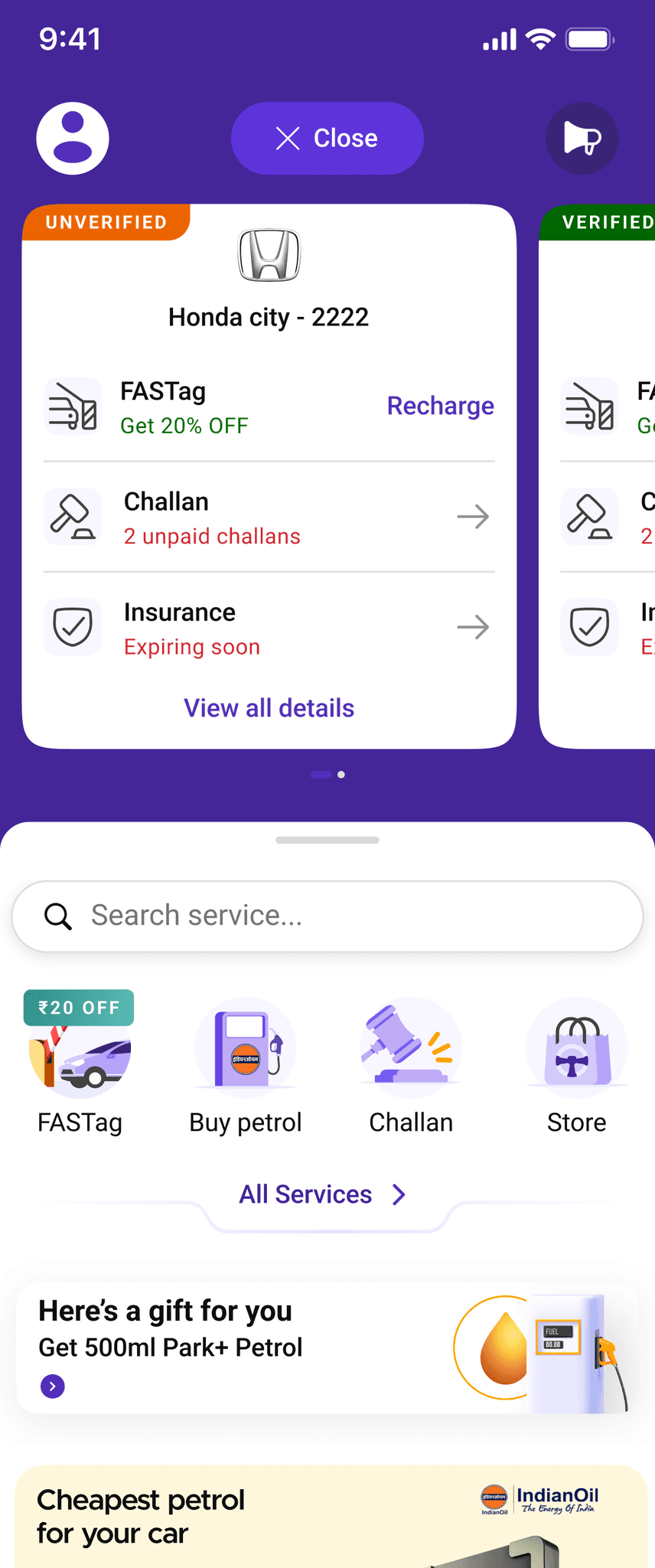
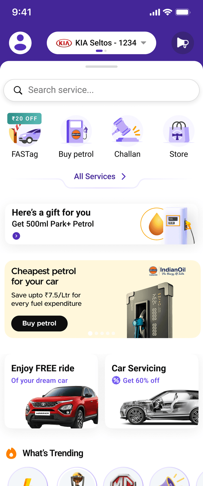
The top bar is mostly seen as the most underutilised space- now displays information about the user's car:
This change makes the top bar more functional and user-centric, providing quick access to important car-related details, such as verification status, FASTag, challans, and insurance
By utilising the top bar for essential car information, users can quickly access critical services without scrolling, enhancing the overall navigation experience.
As my cars product was not a value add in terms of data but it is a car app, and based on cars, the business can promote their other valuable services, we decided to keep the section but in a way that the area is not that much but still prominant

FASTag
Challan
Accessories
Buy petrol
Buy petrol

200 ml
Park+ Petrol
History
Earn more

Pay
your bills

Buy
gift vouchers
NEW DESIGN
Full search bar placed instead of icon as universal search was launched 1 month before this project, and user was still not aware about the search functionality. In future, we can make this a button (maybe)
Search, four service icons and all services button strategically placed in close proximity. In user testing, we found out that the setup made it easier for them to quickly find specific services or explore other options.
PARK+ loyalty program (Park+ petrol) placed right after services for better visibility. Based on user calling, we found out that a lot of recent users downloaded the app for Park+ petrol but were unable to navigate to it. As it is the universal currency in Park+, it needed better discovery
Promotional banners and offers are strategically placed within the primary viewing area, increasing the likelihood of user interaction.
All car related services in the first fold. As we market the app as “Superapp for cars”. A lot of users who were called said that they were unable to relate
to the app


FASTag
Challan
Accessories
Buy petrol
Buy petrol
200 ml
Park+ Petrol
History
Earn more
Pay
your bills
Buy
gift vouchers
NEW DESIGN
Stories are only there for in app, and external partnerships. As a surprise, we found out in user testing that the users were still able to navigate to this section.
Brand vouchers had logo and products marketed outside for better service awareness. In user testing, we found out that users did not understand- shopping/car accessories, car shop, brand vouchers, brand deals just by their name, they need visuals. That’s why we chose to display it using images.
We made it a 2 fold homepage, 73% increase in users who scrolled till the end.
Prominent invite a friend resulted in increase in user referrals